Day 1 of 14#AirflareChallenge
 Featured case study
How machine learning lifted the metric Microsoft's MileIQ runs on
UX strategy · Product design · Marketing
We find what's stopping your customers, design the website or product that clears the way, and run the campaigns that bring people to it.
Worked with




Why Breakin' Boundaries
A menu with one item too many. A product page that never says what's inside. An ad people scroll past in the first second. We find those moments, then design and market our way through them.
How we workEvery project begins with interviews and real data. For Coach Sambo, that meant ten user interviews before we drew a single screen.
The people who design your site also plan the campaign that sends traffic to it, so the promise in the ad matches the page people land on.
Our reports say what moved, what stalled and what we'd fix next, and we teach your team how to read them. The Coach Sambo report flagged the page buyers were leaving from.
Selected work
Most of the new traffic came from Instagram, the audience he already had. Directional, from the site's own analytics.
Working on something like this?
Start a projectIn our clients' words
Our site had plenty of traffic but almost no sign-ups. They rebuilt the landing pages and the messaging together, and conversions were up 47% within a quarter.
Sharp, fast, and honest with us when we needed it. We'd hire them again tomorrow.

They didn't vanish for six weeks and come back with a big reveal. We were part of every key decision, and our own team came out of the project sharper than it went in.

Services
Four services that work alone or together. Pick one to see what's included.
We interview your customers, study your competitors and read your analytics. Then we turn what we learn into personas, user flows and a short list of what to fix first.
What's included
We go from paper sketches to wireframes to high fidelity design for websites, web apps and mobile, with clickable prototypes you can test before anything gets built.
What's included
Logo

Color
Type
In use
Logos, color and type systems, and simple rules that keep every page, banner and post consistent, whoever is making them.
What's included
Day 1 of 14#AirflareChallenge
14 day challenge
PPC, email and social campaigns built around what your audience already watches and shares, then A/B tested until the numbers move.
What's included
Approach
This is how the Coach Sambo redesign ran, from the first interview to the final presentation. Research keeps going while design starts, so what we learn can still change the work.
After launch, we read the analytics with you and plan the next fix. For Coach Sambo, the data pointed at the masterclass buy page.
About
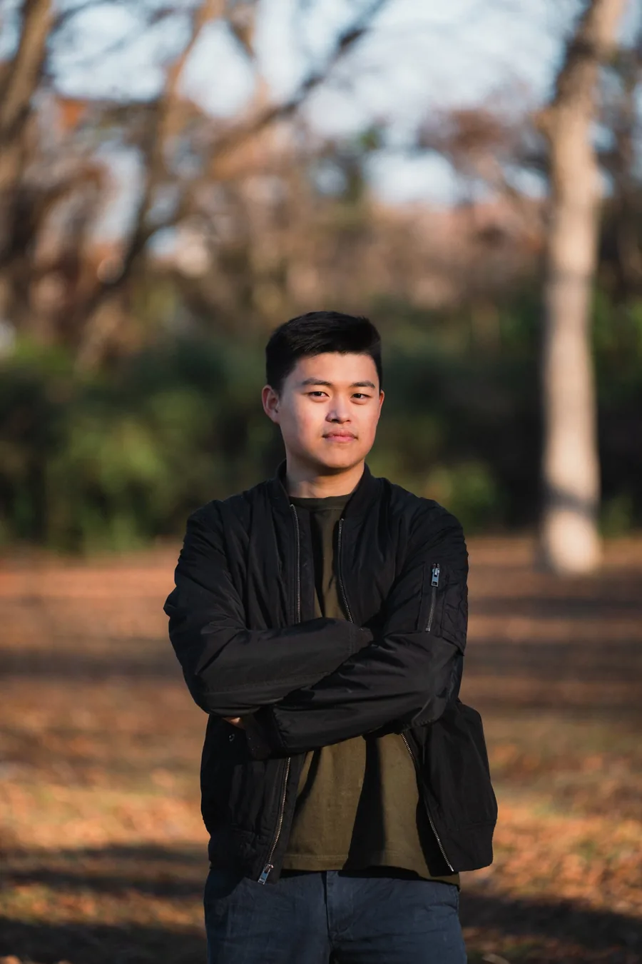
Conway Xu founded Breakin' Boundaries in 2020 to help breakdancers turn their passion for the art into a sustainable living. Today it's a UX and marketing consultancy in Plano, Texas, working with creators, small businesses and teams inside larger companies.
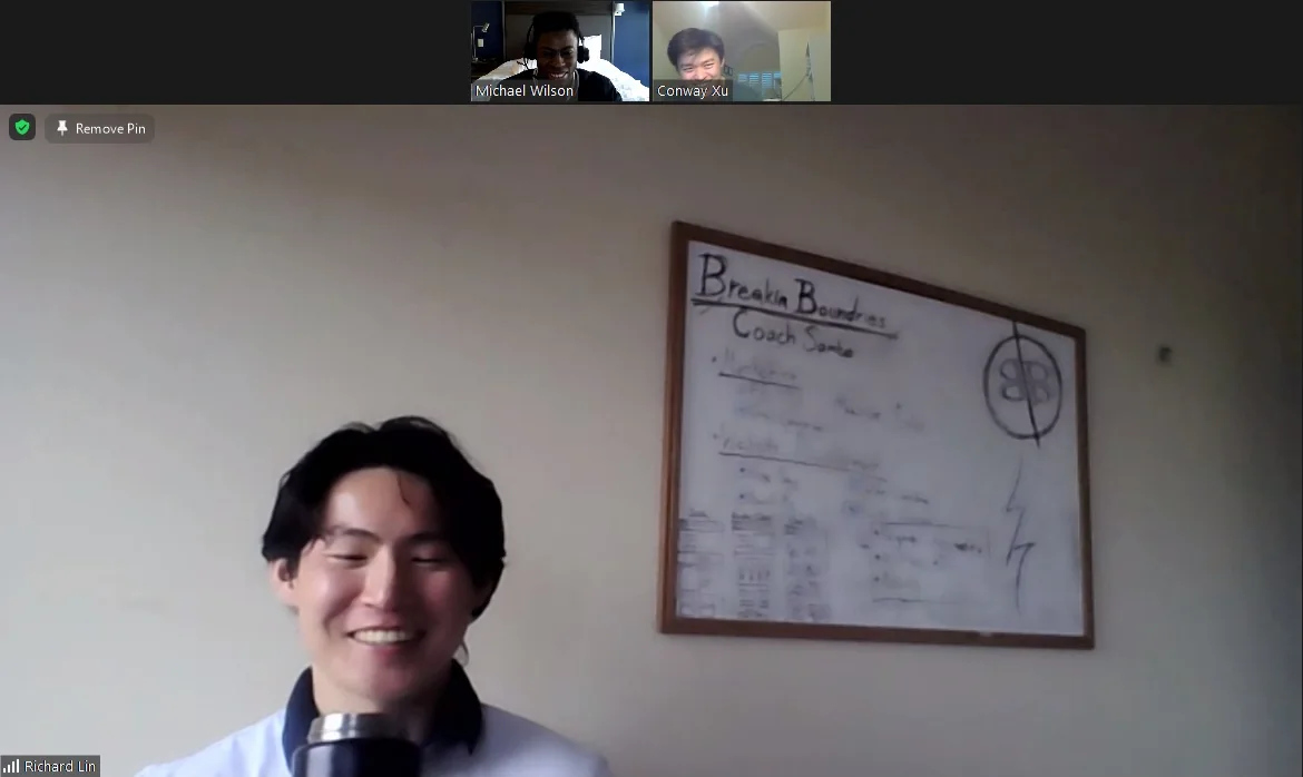
By March 2021, the studio was a Discord server, a Zoom call and a whiteboard with Coach Sambo written on it. The tools have changed since then. The habits haven't. We talk to real users, sketch before pixels, and say plainly what the numbers show.
Founder
Started in 2020 to help breakdancers turn their passion for the art into a sustainable living.
Conway leads marketing across PPC, email, social and website optimization, with A/B tests on ad copy, video and landing pages.
Conway XuFounder & Marketing Lead



Field notes
Contact
Tell us about the website, app or campaign you're working on, and what you'd like to change.
Ready to send
Copy it and send it to hello@breakinboundaries.studio, with the first line as the subject, or open it in your mail app.
Case study · Website redesign
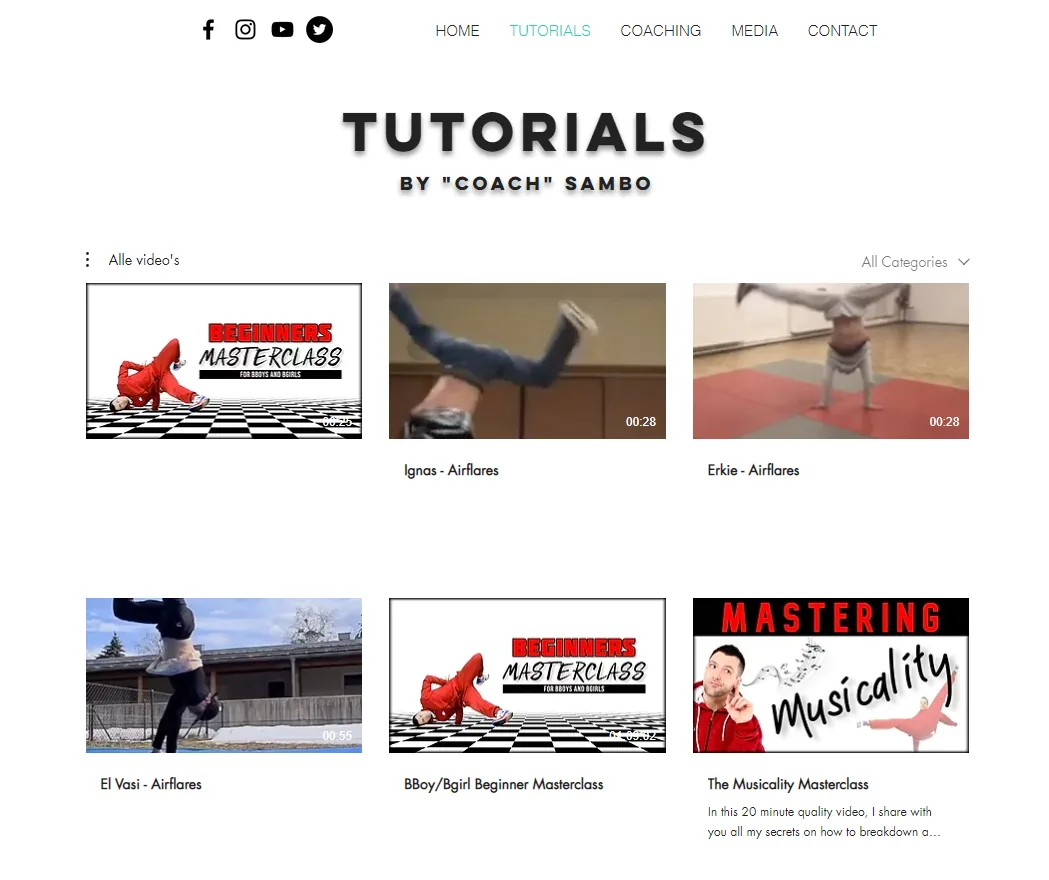
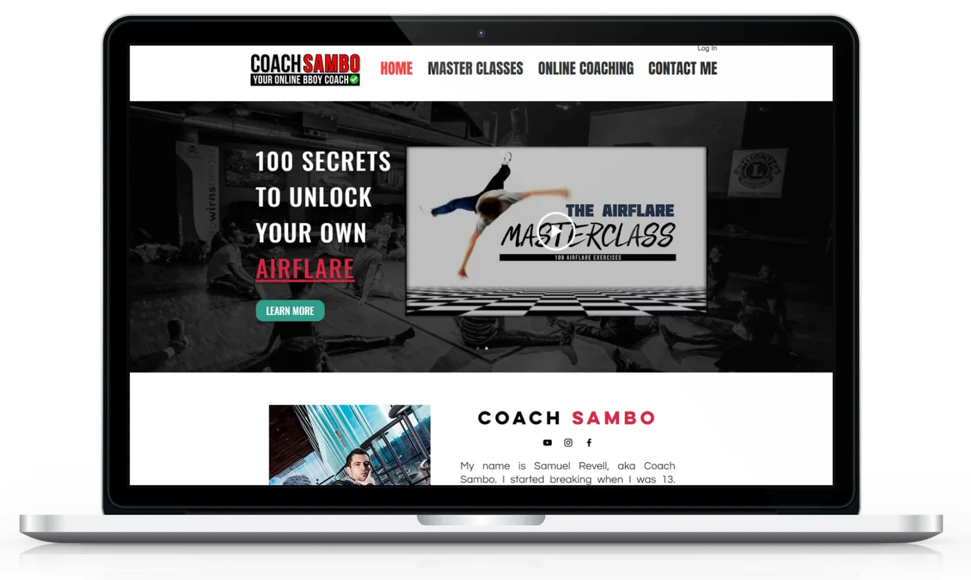
Coach Sambo sells breaking tutorials to fans who find him on YouTube and Instagram. In eight weeks we redesigned his site so the first thing a fan sees is something to buy.
The brief
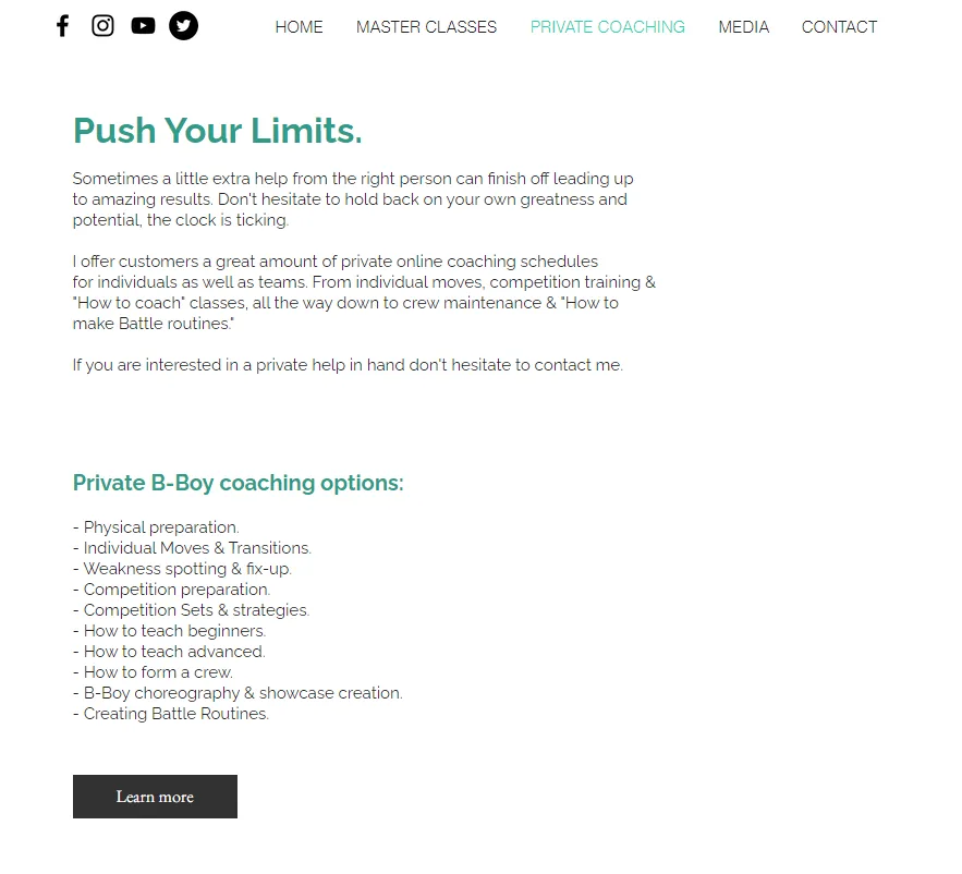
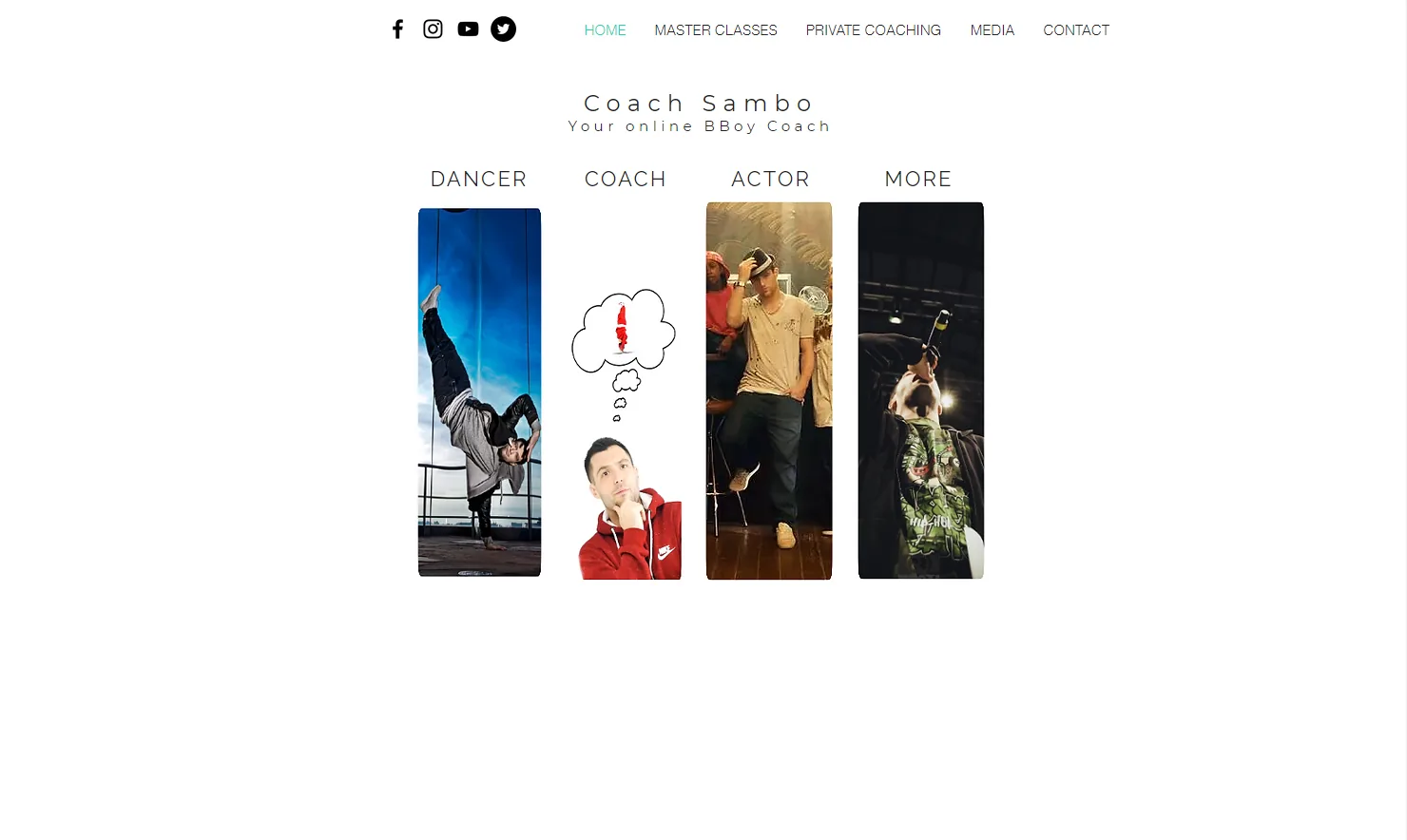
Samuel Revell, known as Coach Sambo, sells free and paid breaking tutorials. Fans found him on YouTube and Instagram, then landed on a homepage with no clear way to buy.
Research
We asked ten people about the social apps they use, where they'd buy a training course and how they felt about Sambo's content.
Who we designed for
Structure
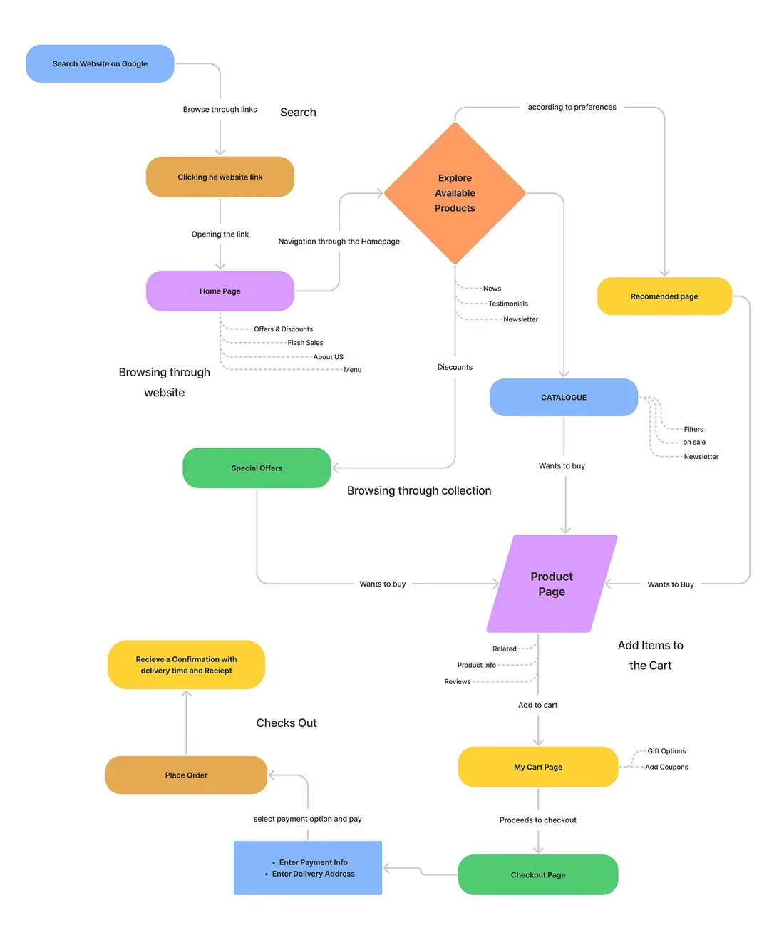
The user flow traced the path from a Google search to checkout. Card sorting cut the main menu from five items to four.
Wireframes
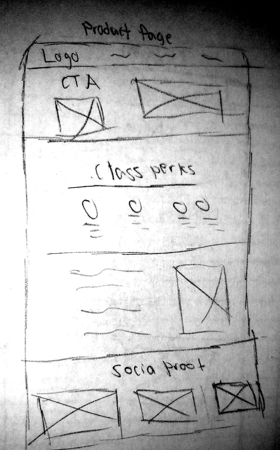
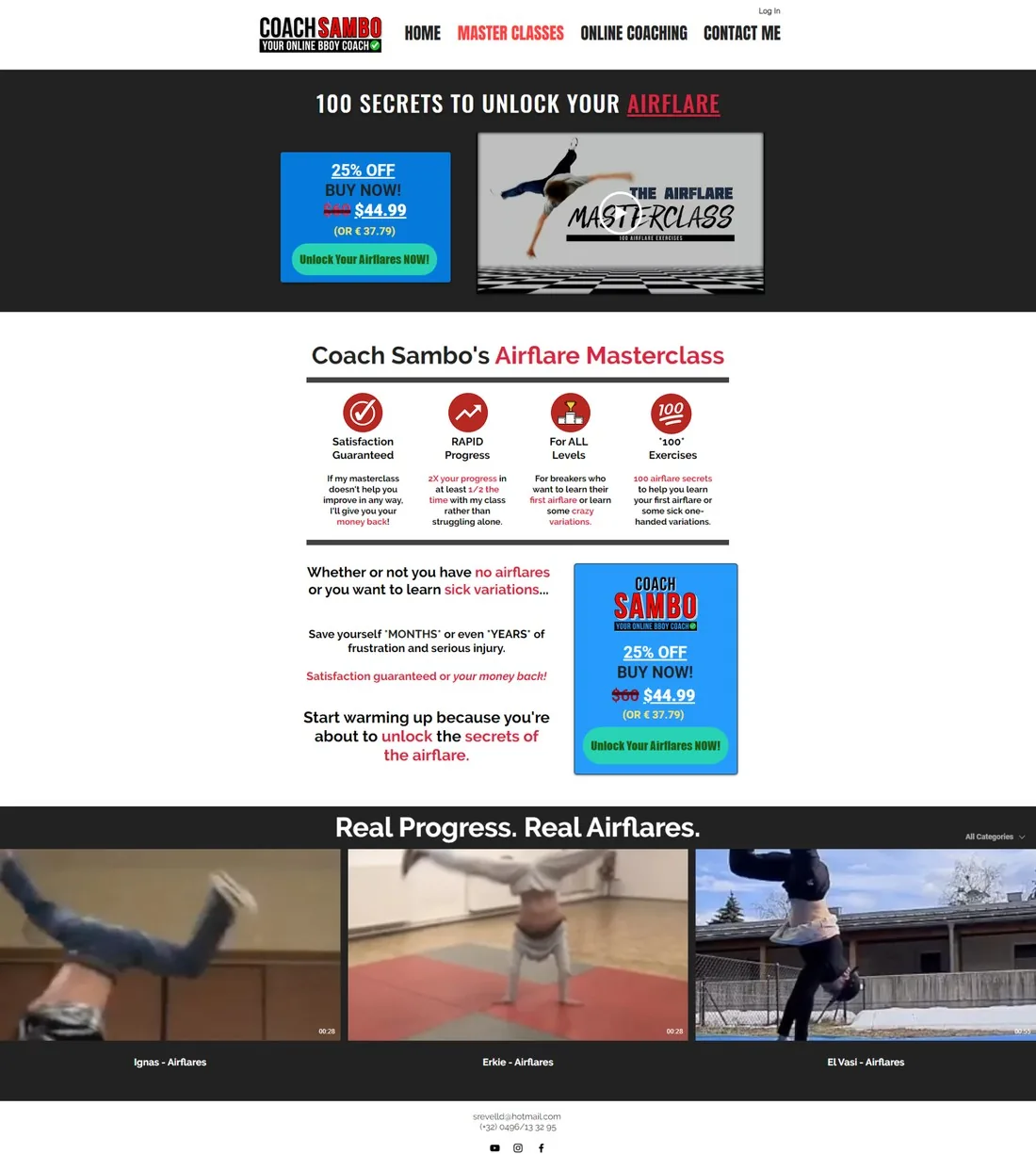
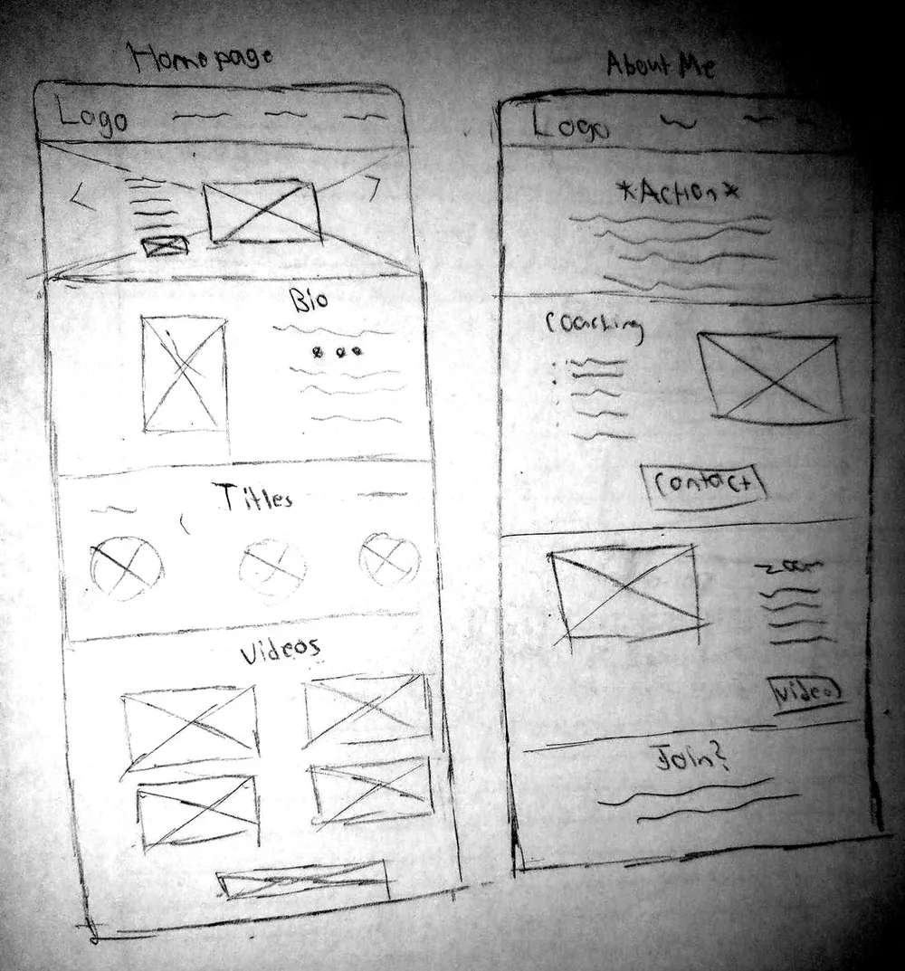
Low fidelity layouts for the main pages came before any pixels. The product page sketch names each block, from the logo and call to action to class perks and social proof, and the finished page keeps them in that order.
Brand
A new logo, four colors and three typefaces, each with one job.
Logo
Color
Type
In use
The pages
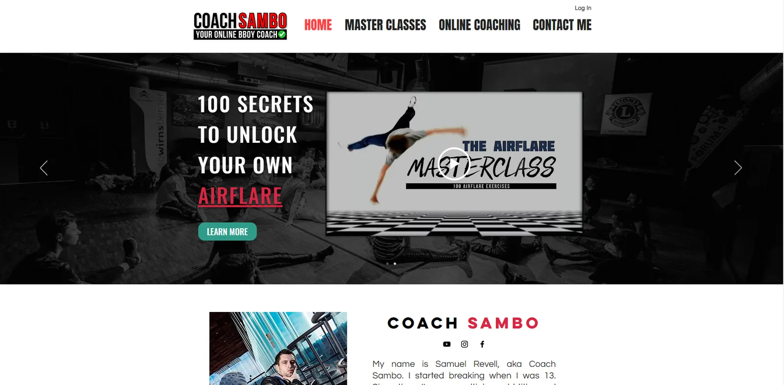
Switch between before and after on each page.
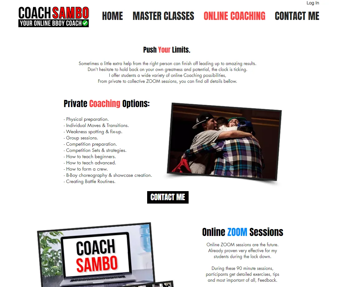
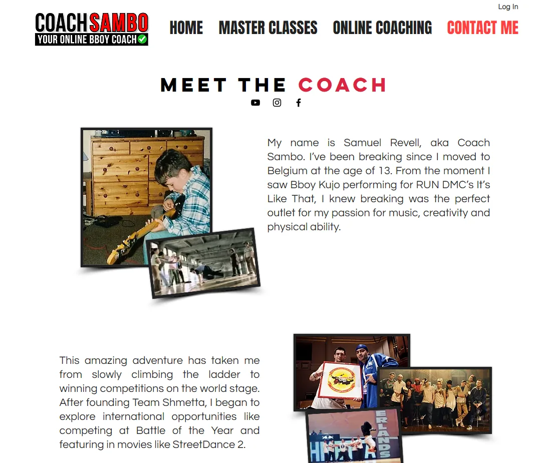
More visitors.
Longer visits.
More sales.
Most of the new traffic came from Instagram, where his audience already found him. The analytics also flagged the next problem. People often left from the Airflare Masterclass buy page.
Directional · From the site's own analytics
Our site had plenty of traffic but almost no sign-ups. They rebuilt the landing pages and the messaging together, and conversions were up 47% within a quarter.
Looking back
Seven days of analytics showed the direction. A longer window would have given us numbers we could stand behind.
The analytics pointed at the masterclass buy page. That's where we'd go next.
Case study · Ad & social campaign
An ad review and a 14 day social campaign to launch Coach Sambo's Airflare Masterclass on Instagram and YouTube.
Day 1 of 14#AirflareChallenge
The ad
We reviewed the masterclass ad and rebuilt it around the first few seconds, when people decide whether to keep watching.
Hook
0 to 5 sec
A question on screen with a fire emoji, over five seconds of the most exciting moves.
Introduce
4 to 6 sec
Show the masterclass thumbnail for about two seconds.
Prove it
Middle
The most striking clips, like double airflares.
Call to action
End
A black end card with short text and icons.
A square video doesn't take up enough of the feed to stop the scroll. A 4 by 5 crop does.
Drop “Coach Sambo Presents.” Keep the masterclass title and one image, and remove the website, the exercise count and the promise to save time.
The campaign
The campaign gives away real training every day and mentions the masterclass briefly, with a pointer to the link in the bio. Posts that are only about the product were left out.
Kickoff post for a 14 day challenge to level upDaily airflare exercise in Stories
Channels
Delivered to Coach Sambo as a nine slide campaign playbook.
Case study · Product design
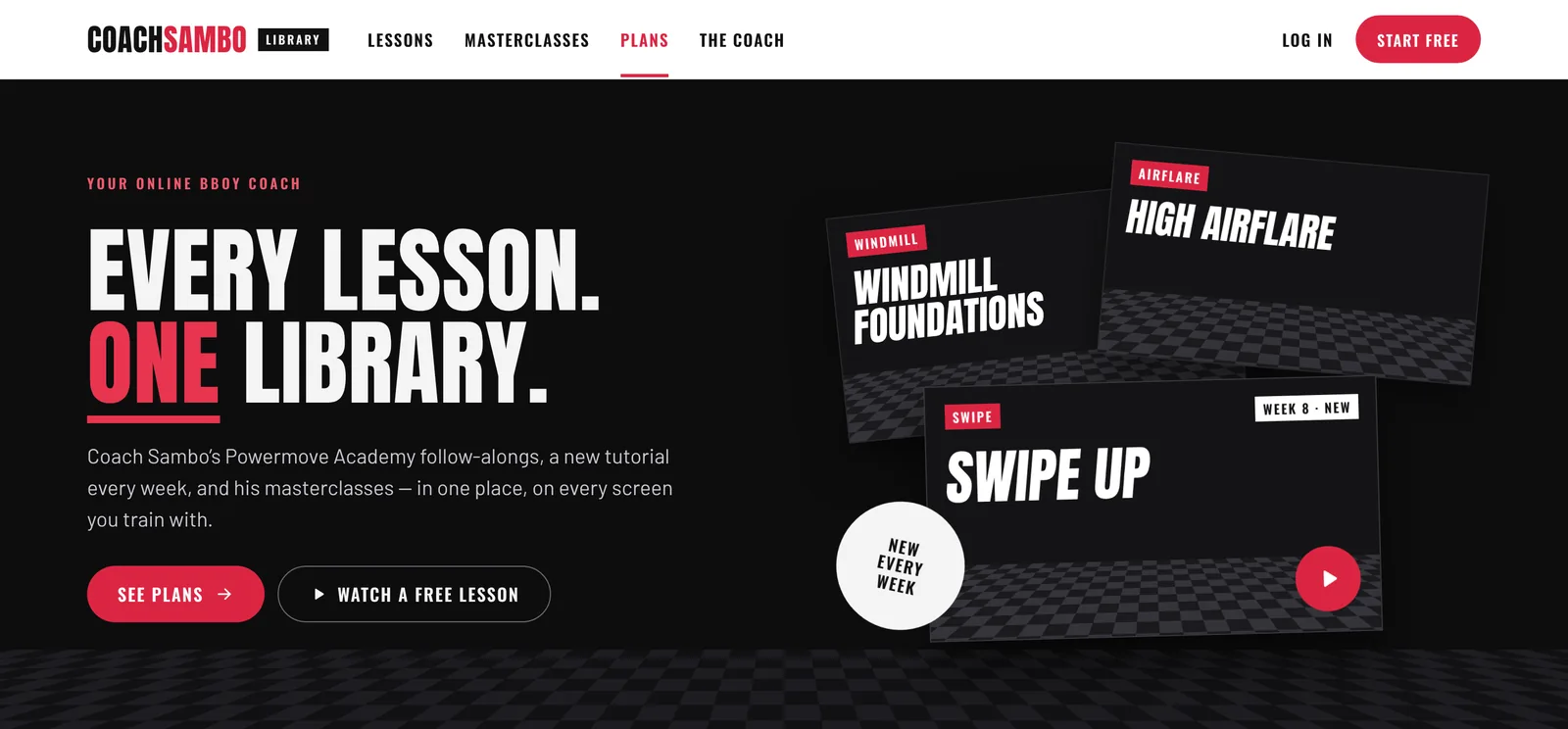
After the website, Coach Sambo wanted one paid home for his follow along videos, a new tutorial every week and his masterclasses. We designed the prototype and tested it with users in 2022.
The problem
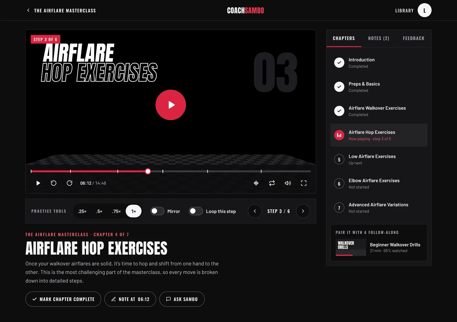
Jake, the student from our website research, had no local teacher and no feedback on his training. So every lesson in the library has practice tools built in.
Lesson player
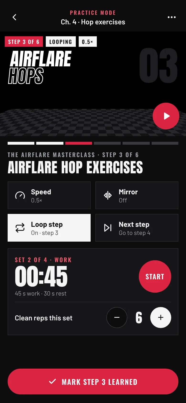
Progress
Masterclasses are split into chapters you train in order, each marked done, in progress, up next or not started. My Arsenal tracks every move from learning to clean to battle ready.
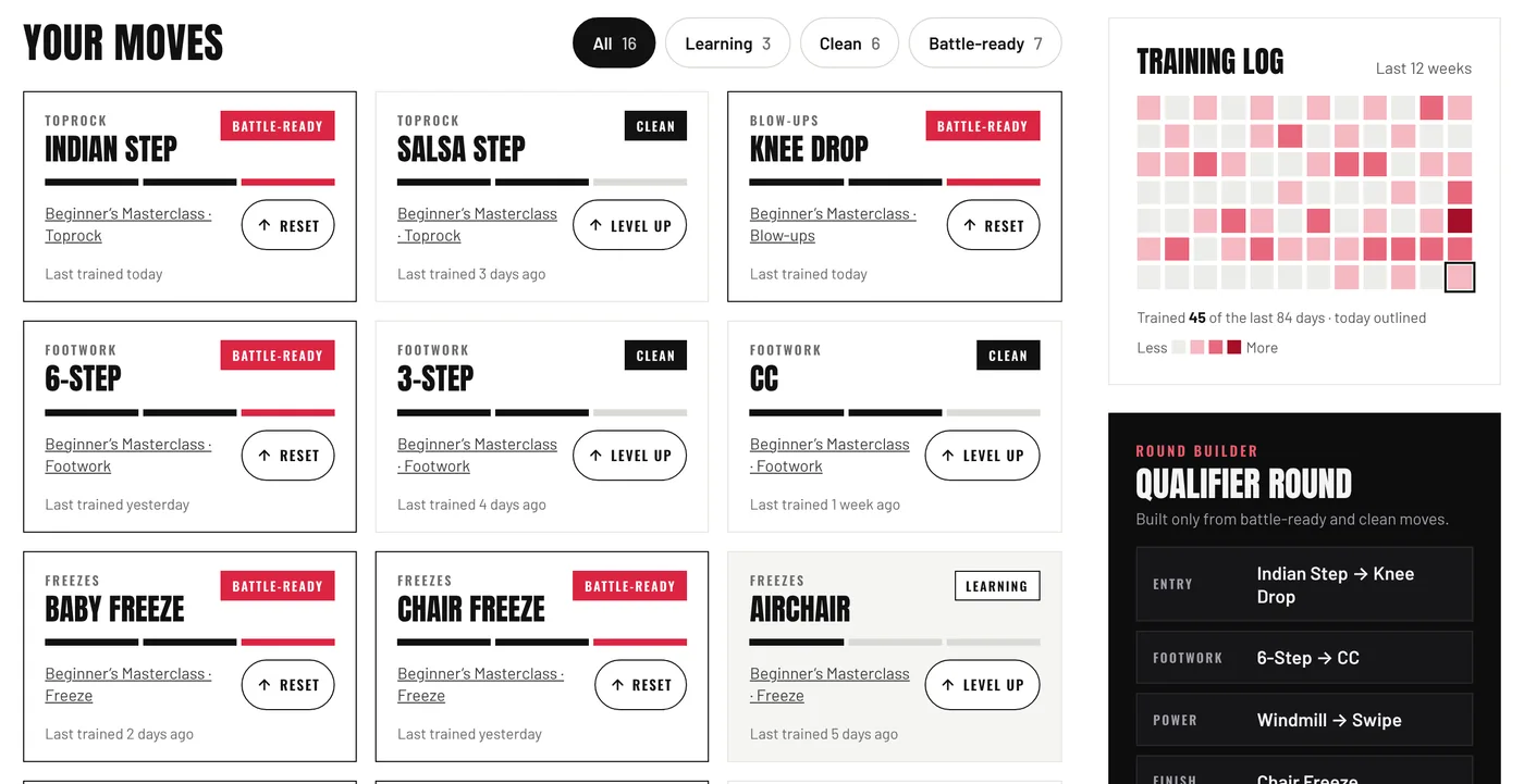
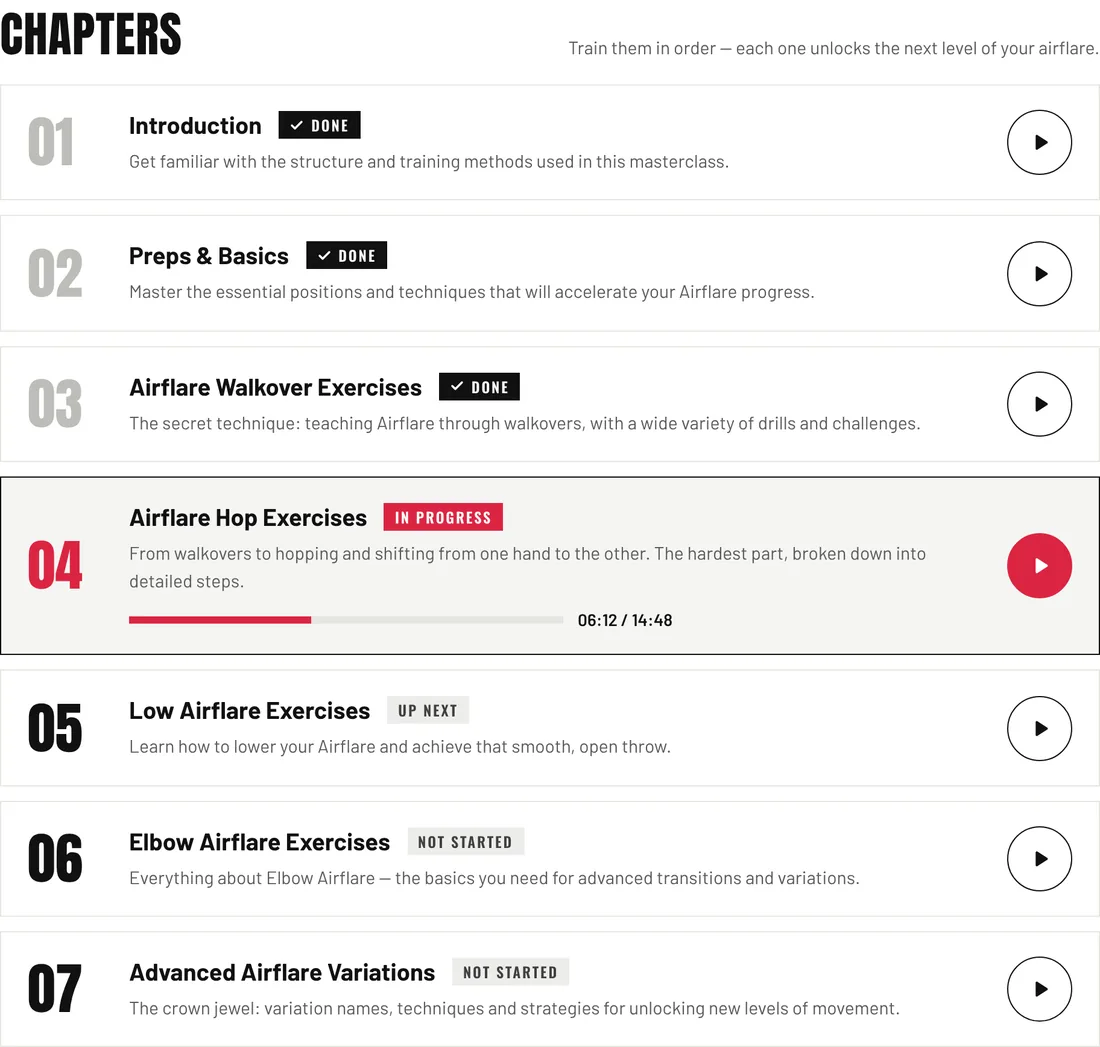
Status
The library has mostly stayed a prototype, so we show it as design work. The screens here are a 2026 rebuild of the 2022 prototype, nine screens across desktop and mobile, from joining and browsing to the lesson player, progress and billing.
Case study · Designing for AI
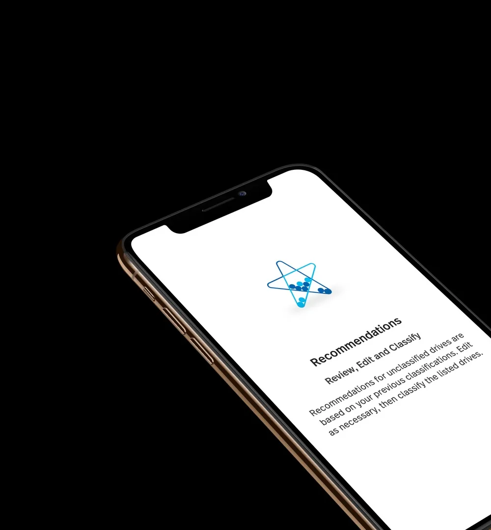
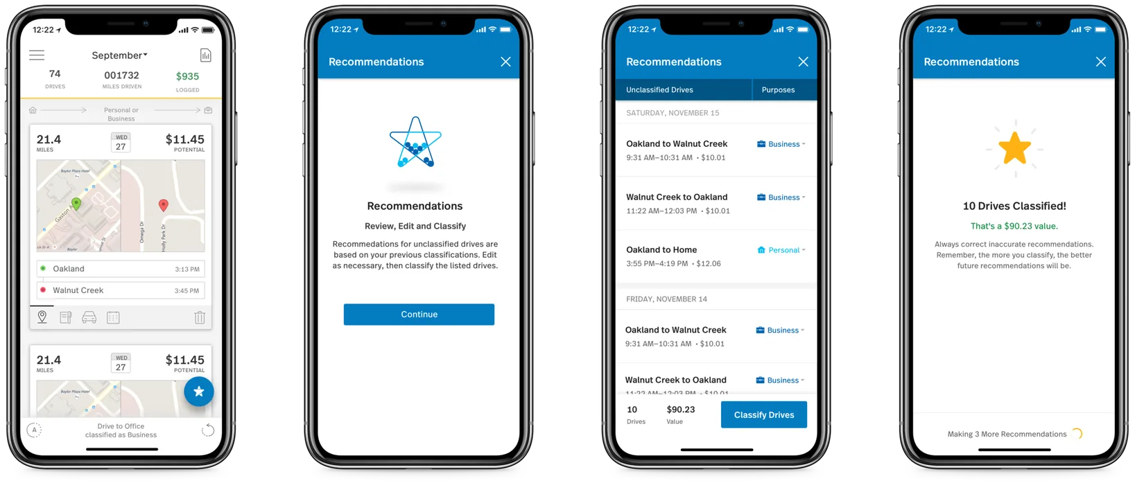
MileIQ tracks drives automatically, but every drive still has to be marked Business or Personal, because that's what becomes a tax deduction. We designed machine learning recommendations that turned classifying drives one at a time into a single reviewable list, and lifted the metric MileIQ runs on.
The problem
Take a drive, see it in your feed, classify it, report it. Classifying was the one step users kept falling behind on, and a user who stops classifying is a user about to churn.
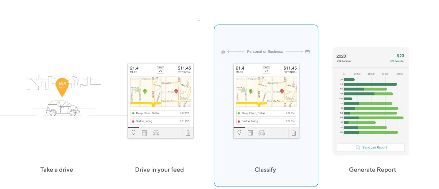
Share of classification issues across interviews, surveys, feedback and support tickets. An unclassified drive is a missed deduction, worth up to $6,200 a year.
Primary persona
The goal
Make classification less manual, more efficient and more accurate, all at the same time.
Decision 01
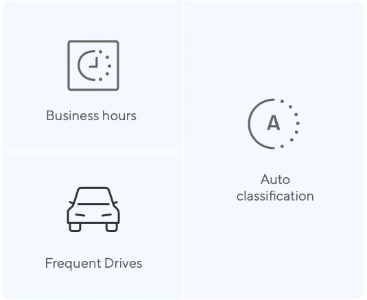
MileIQ already classified repeated drives with rules, like a daily commute. But rules only catch predictable patterns, and most driving isn't predictable.
The reframe
“Automate more”
“Make the app intelligent”
Use each user's own history to recommend a classification for every drive.
A recommendation can be wrong in a way a rule can't.
That made trust the central design problem.
Decision 02
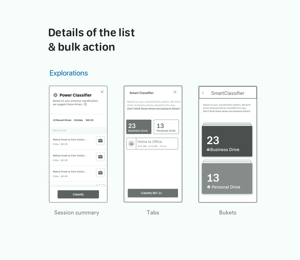
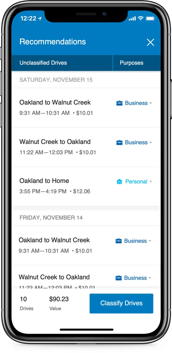
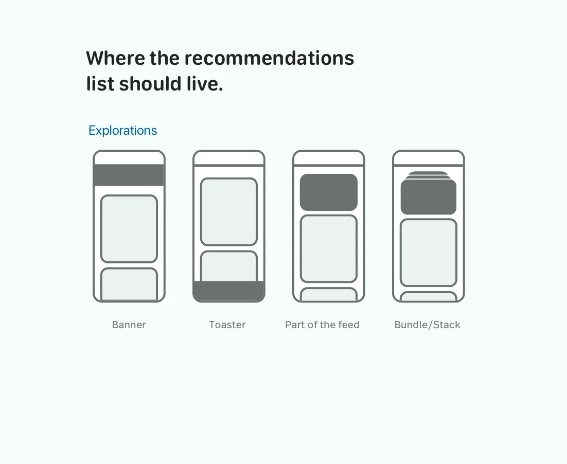
How do you present a batch of machine suggestions? We explored buckets, a session summary, tabs and a plain list, and tested them with users. The feature only works if people look at each guess before accepting it.
Explored
Chosen
Inside the list
The cap
Ten drives a session, so the list never becomes a wall. Someone with 40 unclassified drives moves through four sessions.
Shipped

Explored, then cut
Decision 03
We put recommendations behind a floating action button instead of threading them into the feed. A predictable entry point meant users always knew where recommendations lived, and a brand new ML feature arrived without disrupting the classification flow people already knew.
Explored
Chosen
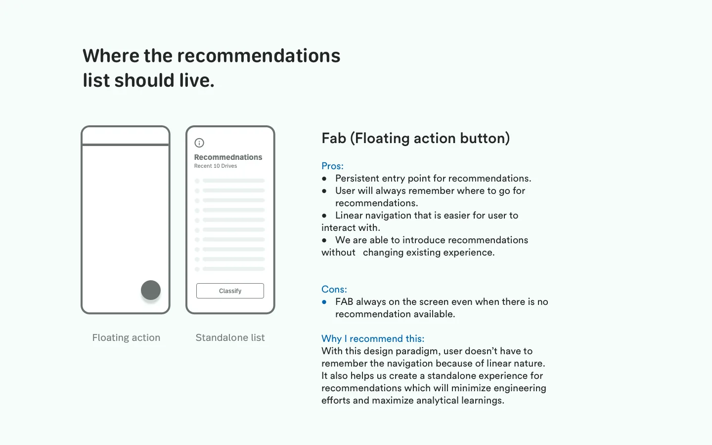
The tradeoff
The button stays on screen even with nothing to recommend. We judged a predictable home worth more than a perfectly contextual button.
Built for trust
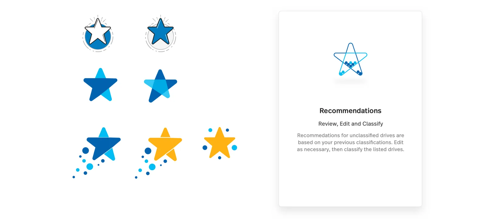
We reused MileIQ's star, long the app's mark for a finished task, so the ML feature read as part of the app, not bolted on.
Written with the team's UX writer, the words frame the feature around a learning curve, not a promise of perfection.
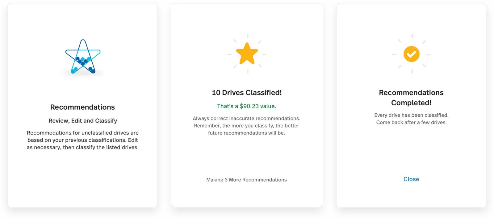
Setting expectations
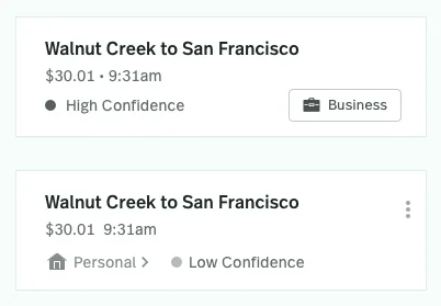
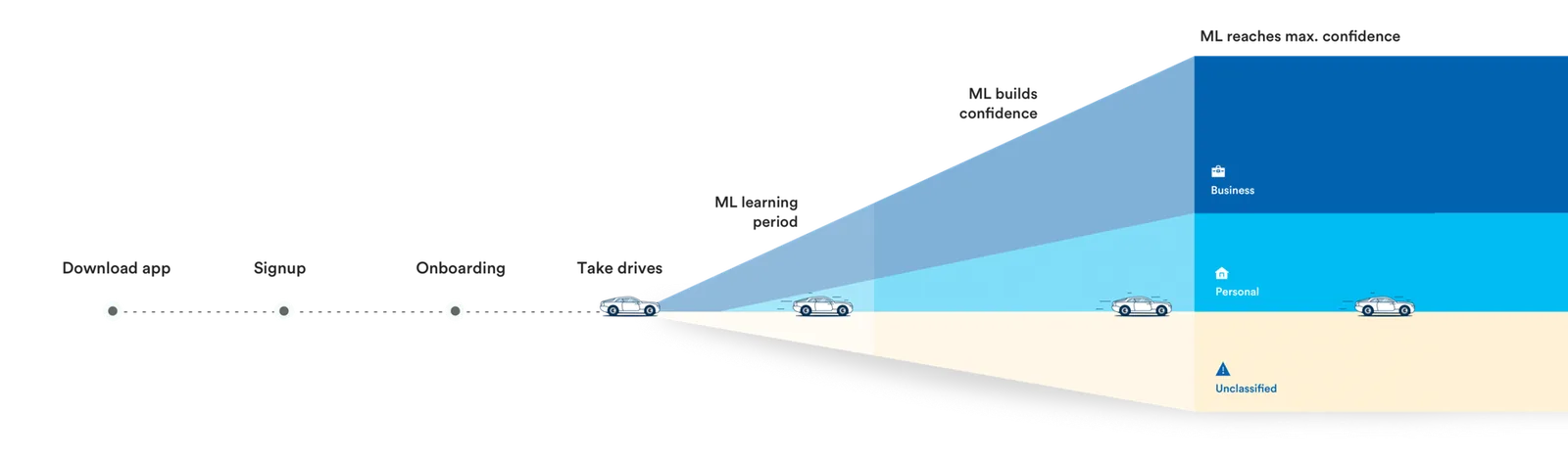
The model starts in a learning period and builds confidence as people classify. An early wrong guess reads as “still learning,” not “broken,” and corrections feel like training the system, not cleaning up after it.
55 to 65%
rose to 70 to 80%
A 10 to 20 point rise in the share of drives users classify, the metric MileIQ runs on. Users also reported more confidence in their classifications, easing the accuracy anxiety the research surfaced.
A range on purpose · Reported before the numbers fully settled
Recognition
Microsoft filed a patent on the machine learning model behind the feature. The team, including our product designer, received the Microsoft Patent Award.
Who did what
The patent covers the model, and our designer isn't a named inventor. Our part was the experience it ships inside, meaning how people review and correct, the patterns that build trust and control, and the bulk classification flow.
Looking back
Right for launch, because it kept the list scannable. For people with big backlogs, it turns one decision into several sessions. Next, we'd test a progressively loading list or an adjustable batch size.